Showing posts with label 20x200. Show all posts

Tuesday, 3 December 2013

Some New Art

I have bought some new art and thought I'd share. It hasn't arrived yet but I can't wait to get it!!
Gray Malin
First up is this Gray Malin print. There were so many to chose from this collection but I liked this one the best. You can see the rest of his work, including the rest of the Prada Marfa collection here. It's an intriguing story behind this photo and I'll let Mr. Malin explain it:

Marfa, a famous arts town located in West Texas, is home to many intriguing artistic endeavors; most notably a Prada store art installation. Filled with a 2005 collection of Prada purses and shoes, the store is sealed shut and sits freestanding on the side of the open highway.

That's just weird. I want it.
Steve Lambert
I have finally bought this print. Finally. There was a bit of rigamarole with the process but 20x200 was very helpful and I got it! Now I just have to figure out which room it belongs in. I always thought the dining room would be an amusing place for it. But then I cringe at the thought of explaning the joke to my dad.
Elizabeth Huey
And I am getting this for Christmas from my wonderful mother in law! The artist statement about this print leaves me feeling dumb. I like it because I like the way it looks. Okay, maybe I am dumb. To me it feels very 1960's and I'm reminded of a James Bond ski scene.
Stuart Klipper
New on my wishlist is this beautiful and eerie photograph of icebergs in the Antarctic. But I think this will have to wait. For now.
Here's my cow up on my dining room wall. She's so pretty. I bought her back in the early fall at Home Sense but haven't shown her off yet. She's very big and colourful and a great focal point in the dining room.
This is my DIY Rorschach art. I got the idea from Hannah J. at Angel Babies, Paint and Cookies  who shares her inspiration and tutorial. I've made two and have both framed and hanging in my dining room but I'm not really stoked about the other one so I'm hiding it from you.
A family photograph can be art, right? My talented friend Danaea Li took this photo of us this fall. It sits in our hallway in a beautiful frame from Indigo. I need to frame and hang some more from her family photoshoot with us. So many beautiful photos!

And here's what Georgina and I worked on today. It will remain a working project for a few weeks until I finally paint over it with white and start over or maybe it will be a keeper and end up in the playroom. Time will tell.

So, do you like my new art? I've always been very partial to photography and have only in this last year started collecting paintings as well. Although, lets be honest, I don't have the budget to buy anything more than prints of paintings. But I don't mind. 

How about you? Do you prefer paintings or photography?

Wednesday, 6 November 2013

Update on 20x200!!!!!

THEY ARE BACK AND ONLINE! 

20x200 is not fully up and running BUT they sent out an email today explaining that they are selling in stock art on another website of theirs youshouldbuyart.com

This is FANTASTIC news!!!!!!! Now I can buy all the art I regretted not getting before this whole mess and it tides me over until 20x200.com fully relaunches.

To celebrate I am finally going to purchase this
Joseph O. Holmes
 And have sent an email inquiring about this
Steve Lambert
Because they have just reopened they haven't made all of their art available immediately but will be reintroducing art from their inventory every week. If you have a specific peice of art in mind, like I do, you can send them an email and ask them about it, like I have.
I also really want these
Erich von Wunschheim
Elizabeth Huey
Feeling very wintery.

My only dilema with the relaunching of 20x200 is that I need more walls to hang my art!
Congratualtions  +Jen Bekman and everyone else at 20x200!

*update*
Shoot. They are not presently shipping to Canada. That will hopefully change soon. It is still GREAT news and a wonderful step in the right direction.

Thursday, 26 September 2013

Thinking About 20X200

I'm so excited about 20x200 making a comeback! (as previously mentioned here.) Their mandate is to make art accessible to everyone by selling beautiful art at ridiculously low costs.
In honour of their return and to get everyone else as psyched up as I am I thought I would share my love  for +Jen Bekman's project in this post.

First off, I'll share my collection. It's wonderful! And makes my home so much prettier and happier and interesting.
Christian Chaize, Praia Pequena from 20x200. Ugh. Excuse the glare. Darn sunny days ruin EVERYTHING. jk.
With the exception of the black circles and the photo of the baby feet sticking out of the bumbo (seen in the middle photo), all these photos are from 20x200. I painted the black circles, inspired by this post by a talented local blogger. And Georgina took the picture of Miriam's feet on Easter morning. They fit in nicely.

I was so excited when they added two more Christian Chaize prints to their collection last Christmas. I bought the first one they put up instantly and something like the next day they put up the second. I was faced with a dilema: I didn't need TWO Praia Pequena prints, right? But I liked the second one so much better!! So I bought it too and I told myself I would give the first one as a Christmas gift. That did't happen. I have another Christian Chaize in my bedroom but from a different series of his. I bought it first when I was coveting the Praia Pequena series. I love it more in some ways. This is it below.

Christian Chaize, Apres Grande 7, mine is framed in a brown frame instead.
Dress Code, Bastienne Schmidt

Hanging in Miriam's nursery (more on that later) I have a large print of Dress Code by Bastienne Schmidt. Her nursery is soft pinks and greys and this adds a bright mix of colours and makes the room feel less baby but still playful.
I have a few more prints from 20x200 that have yet to find a proper home in our house, including another by Bastienne Schmidt. And a couple others that need to be properly matted and framed.

A while back I entered a contest through Pinterest where you post all your favorite 20x200 prints for a chance to win a book by one of their artists, Jorge Colombo. I WON!! While I did end up collecting most of what I had pinned on my board there's still a few that I was so disappointed I'd missed the opportunity to purchase. I'm really, really, really hoping they will keep their old collection as well as the new art they introduce weekly. Christmas time is my favorite! They have new art daily. Here's a few that remain on my wishlist, soon to be fulfilled, hopefully.

The one that got away. This is a part of a series called Drawings For Three Rooms In Your Home, by Steve Lambert. I am just not brave enough for the first two from the series.

Here we have People Who Eat White Bread Have No Dreams, by Simon Fujiwara. I have no idea what it means. I love it.

The White Oaks, by Joseph O. Holmes is such a beautiful, quiet and calm photo. I would love it blown up in my dining room. Or as an 11x14 in my bedroom over a nightstand. I love that it looks like black and white photography but isn't.

Jessica Craig Martin, Cougar Friends, would definitely go in my dining room. Or my powder room!

For mor information and to keep up to date on 20x200's status you can go here or here. Can't wait to have you back in my life 20x200! And to see more prints that I would love check out my pinterest board.
What do you think of my living room gallery wall? Do any of you have one in your home? I'd love to see!


Friday, 20 September 2013

Lighting Over My Kitchen Table

To start out, I'm not going to make the same mistake I made here. I'm going to lead this post with a beautiful photo

From Elle Decor featuring a Christian Chaize print from 20x200. Love these chairs!
Now that that's out of the way I can show you my terrible before photos of what I'm working with. Again, please excuse the image quality. My good camera is on a temporary hiatus.

Let's use this as a Before photo for everything in general.


Totally inspiring right? I very recently sold my Eames Eiffel Chairs - reproductions. Not the real thing - and am currently on the hunt for a new table as well. Not sure what I'll end up with. More on that later.
Anyways, I can't find any lighting I like. And can afford (this is key).
I tried this last winter...

Zuo Modern Lighting
But they hung so low over the table and weren't big enough as a fixture. They just looked out of place. They would be wonderful in a loft. I don't live in a loft. Mind your space, you know?

Here's some photos of lighting I love. Peruse at your leisure.


From West Elm
This one's super interesting. And these are the Eiffel Chairs I was talking about. Mine were white.

I like the orange and zebra chairs in this too.

Love everything about this room!

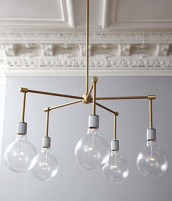
I LOVE this one by Lindsey Adelman. Apparently some people are crafty enough to do it themselves. I am not one of those people.
and speaking of DIY here's one I found through Little Green Notebook


I keep telling myself THIS IS IT but have yet to get around to actually attempt it. Apparently, my friend Arinn can make lamps using items found around her house, like Macgyver, so maybe I'll solicit her help. Also, one of my problems with the lighting over the kitchen table is that it is mounted into the ceiling in the centre of the room, not over where the kitchen table would naturally go. So Stupid. So frustrating. So I need my light fixture to have a chain so I can hook it onto a ceiling hook over the table (what's that all called?). 
See my problem?

Gawd! lol this light is terrible.


I considered a pendant drumshade for quite some time but our kitchen and family room rely on our table light for most of its lighting at night. The recessed lighting doesn't cut it. I don't think a drum shade gives off enough light. Am I wrong? Do any of you have one?
They're oh so pretty!


There's my chairs again! Maybe I'll buy them again.
If you know of any good places to find anything similar to what I currently love let me know. I'm tired of looking at my sad kitchen chandelier.
My dining room, however, has the best light in the world! A sputnik replica!


This isn't my dining room. Or even the same light that I'm talking about. But mine is the same idea. I'll show you later on.


Thursday, 19 September 2013

Remodeling Our Fireplace

 One of the most sure ways to give away your home's age is its fireplace. Some can be worked with with just a simple quick update, like a coat of paint (my friend Arinn is just going to paint her tile surround since her mantle is gorgeous). Others are teardowns. Ours were in between. So I tore them down.

The family room. Here I had initially considered keeping everything as is but sanding off the flower carvings (or whatever
you call that stuff), and then painting it black to match the tile surround. But I wasn't keen on the round cutout above it.

The front room. This one, I liked the structure itself, no flowery carvings (or whatever they're called) to sand off but I hated the grey tile surround and again the cutout in the wall above the mantle. Again, I considered painting the whole thing out either white or black.

So those serve as nice before photos. Because I didn't have the insight at the time to take proper before photos I photographed the realtor listing on my computer screen with my cell phone. Good enough.

I was stumped with what to do but our contractor, Billy Boyes, with Boyes Brothers Contracting, was starting work really soon so I had like a DAY to decide. Then I found THIS

The 2012 Princess Margaret Showhome, designed by, Linda Reeves.


I love the painted brick, minimalist fireplace, the built in shelves beside it, how it's flanked by large art and has a flat screen mounted low above the fireplace. And I've had my eye on that ikea Stockholm table for a while now. But I think they don't sell it anymore? Anyways, I decided, from this photo I had to have white brick going up the fireplace in the front room. It's a tall, vaulted, two story ceiling. It would look BEAUTIFUL.
Turns out, this is a very expensive idea. Even with the interlocking facade brick. So I needed more ideas. Here's what I found


Drywalled! Looks great, very close to my original idea, a little less interesting, but equally modern and minimalist.
Here's some more

This is from House and Home. I like the wood panelling.
This room is just a whole lot of interesting. Love it.
So I was reassured by these photos that  A. a mantle is NOT necessary and B. a simple drywall around a minimal surround will look beautiful.

Billy - I love this man - got to work tearing it all down, drywalling in the alcoves (or whatever they're called), and doing what he does to make my house look amazing.

Front room

Family room


And Billy's final work by my design
update: new photos!
Note the new hearth that wasn't there before. The black tile surround is from the original
fireplace. Saved us money but also worked perfectly with the look I wanted.

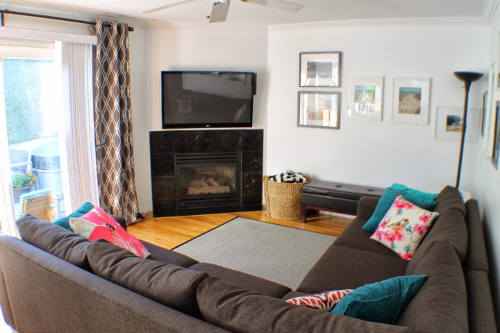
And the family room. To the right of the fireplace I have all my art by 20x200. And if you're curious about where I got any of my accents, I'm just realizing this is almost all Urban Barn.

Beautiful, right? I love when a vision comes together.
Related Posts Plugin for WordPress, Blogger...